terezza
Who is terezza?
The client is a new brand that needs a unique visual identity to separate them apart from the others, already known pão de queijo (cheese bread) brands.
History
Tereza was 72 when she decided to reinvent herself, take a different route and start her own company. A woman who lives for her family and to whom the main love language is cooking for her loved ones. Tereza’s mom was also named Tereza, hence the two Z’s on the brand’s name. They perfected a recipe through two generations and used a decades long expertise on the product.
The brand differentiates itself from the competitors because every part of the process is done on their farm. From milking the caws, producing the cheese to its final delicacy, the most delicious, cheesy, pão de queijo.
Approach
When exploring different aspects of the brand with its owners we could understand that Terezza needed to convey a welcoming, homely and, familiar feel, so people could truly connect to it at first glance.
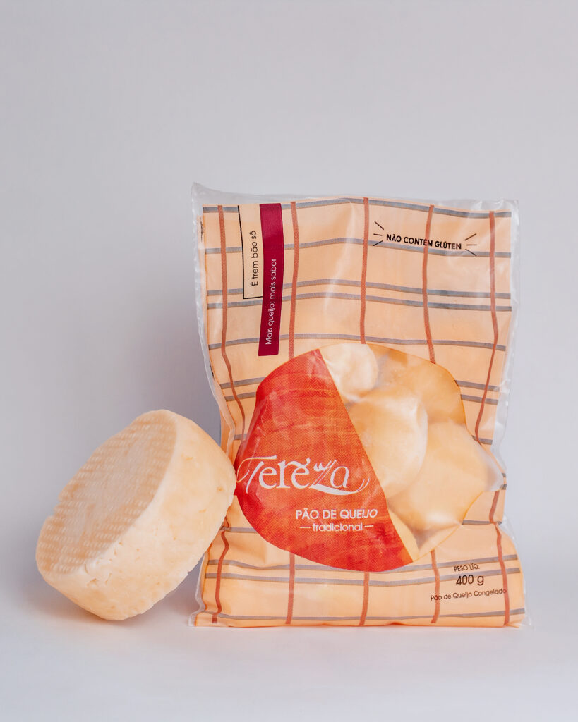
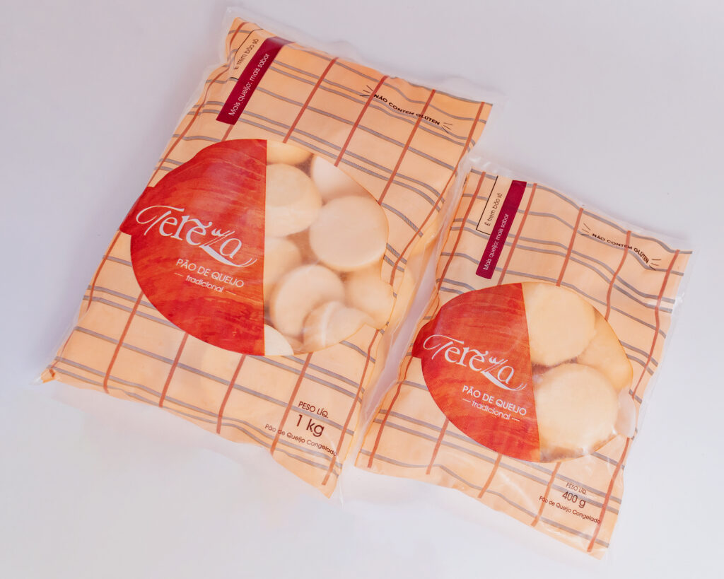
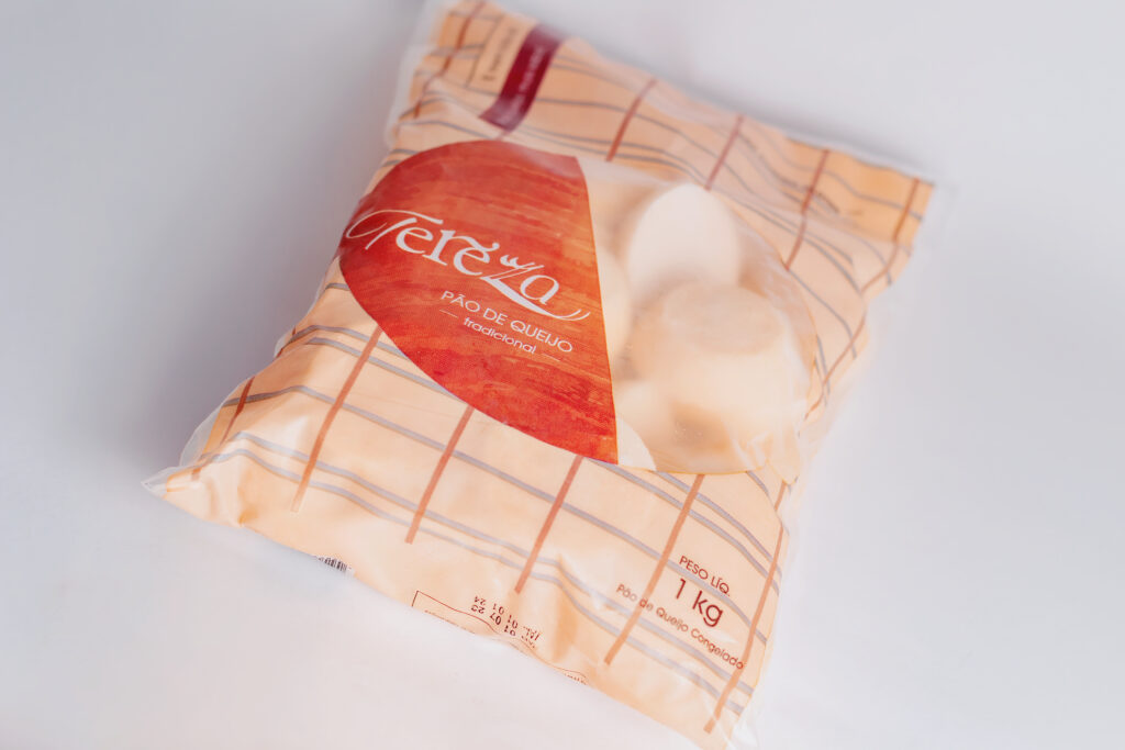
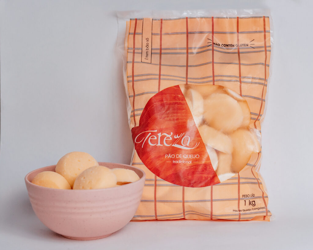
Every Brazilian grandma, including Tereza, enjoys a good ol’ plaid tablecloth. On top of that, Tereza very specifically uses wooden bowls to serve her delicacies. Those were two great references and features to start off the packaging, bringing relatable experience to the audience, while remaining true to the customs and rituals Tereza utilized at her own home.
Unique and minimalistic, the packaging enables people to connect to the coziness of a good coffee afternoon with family and pão de queijo. The icon is inspired on Tereza herself, her statement hair style and glasses. The logo is playful, using the font as a connection between past and present, with its stylized hand written style on consonants and a slightly more modern touch on its vowels. Primary and secondary font is clean, modern and easy to read, the idea here is that they are very legible and don’t overpower our logo design.
Work
Brand Identity
Package Design